
Heads-Up Car Dashboard Display
August 2020
Head-Up Display, Car Interface Design
For this personal project, I designed an HUD (head-up display) prototype that allows drivers to keep their eyes on the road, allowing users to prioritize their safety while still accessing the information needed for driving. The purpose of this project was to understand current car dashboard features and ideate tools/designs to lessen distractions and make driving safer and easier for the user.
Dashboards and HUDs often maximize aesthetic or function while sacrificing usability and user safety. As newer cars favor bigger touchscreens and increasing the number of features, it’s important to maintain good UX design to promote safety and in effect, build a trusting relationship between the driver and their car.
tools & Methods:
Adobe photoshop, Adobe premier, UX research, User Interviews, iteration+mockups,
Time:
10 days, August 2020
My Approach
After initial research on dashboard features, my interests gravitated towards head-up displays. I decided to focus on designing HUDs as a solution to the problem.
A user’s feelings are crucial in their experience with the product. When designing this HUD display, I prioritized how safe or trusting users might feel.
I decided to first research existing HUDs on the market and narrow down their strengths and weaknesses.
From there, I talked to some users (drivers) and identified key features to design for. After ideating and making low and high fidelity interfaces, I created mockups & prototypes and did some more user testing.
The Problem
Drivers need an efficient dashboard/information system with minimized distraction in order to have a safer driving experience and build trust in the vehicle.
Car dashboard areas can be distracting. There are often a lot of buttons and features that can cause information overload. Some features require the driver to look away from the road— large touchscreens require even more attention because the driver has to visually locate the area of information and cannot rely on touch/haptics. The longer and farther the driver has to look away from the road, the more of a danger it becomes.
Research
competitor analysis
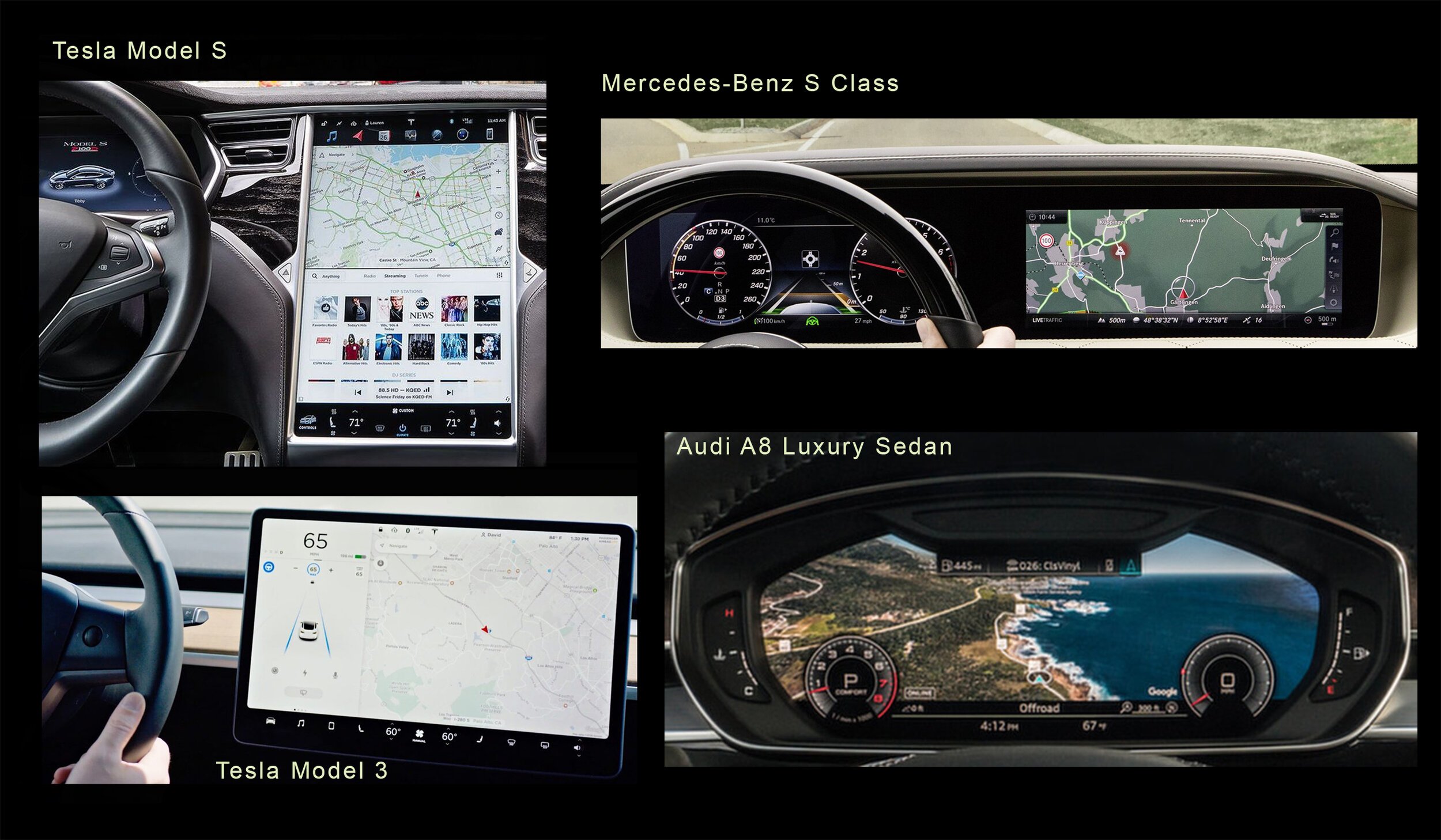
For dashboard interfaces, I researched the Tesla model s and model 3, the Audi A8 luxury sedan and the Mercedes-Benz S-Class.
The Tesla model dashboards’ biggest benefits are its minimalistic and simple design, big screen, ease for upgrades and wifi connectivity. However the main issues are that it lacks haptic feedback, it takes too long to locate information (Fitt’s law), and its button sizes are too small which contributes to accidental touching.
Our process consisted of many stages of research and design iteration while gaining feedback from IBM and users.
The Audi A8 luxury sedan and Mercedes-Benz S class both have beautiful color displays but their displays communicate a maximalist amount of information to the driver. While it is useful to have access to fuel/speed, maps, lane guidance and multiple other information, The user has to search the screen and look past all the other information each time. Having too many signals and displays can be confusing and overwhelming for the user.
I then shifted to investigating HUDs from companies like Lincoln, Mercedes Benz (built in HUD) as well as companies selling HUD’s as an attachable accessory like HUDIFY, ISCOUT and NAVDY HUD.
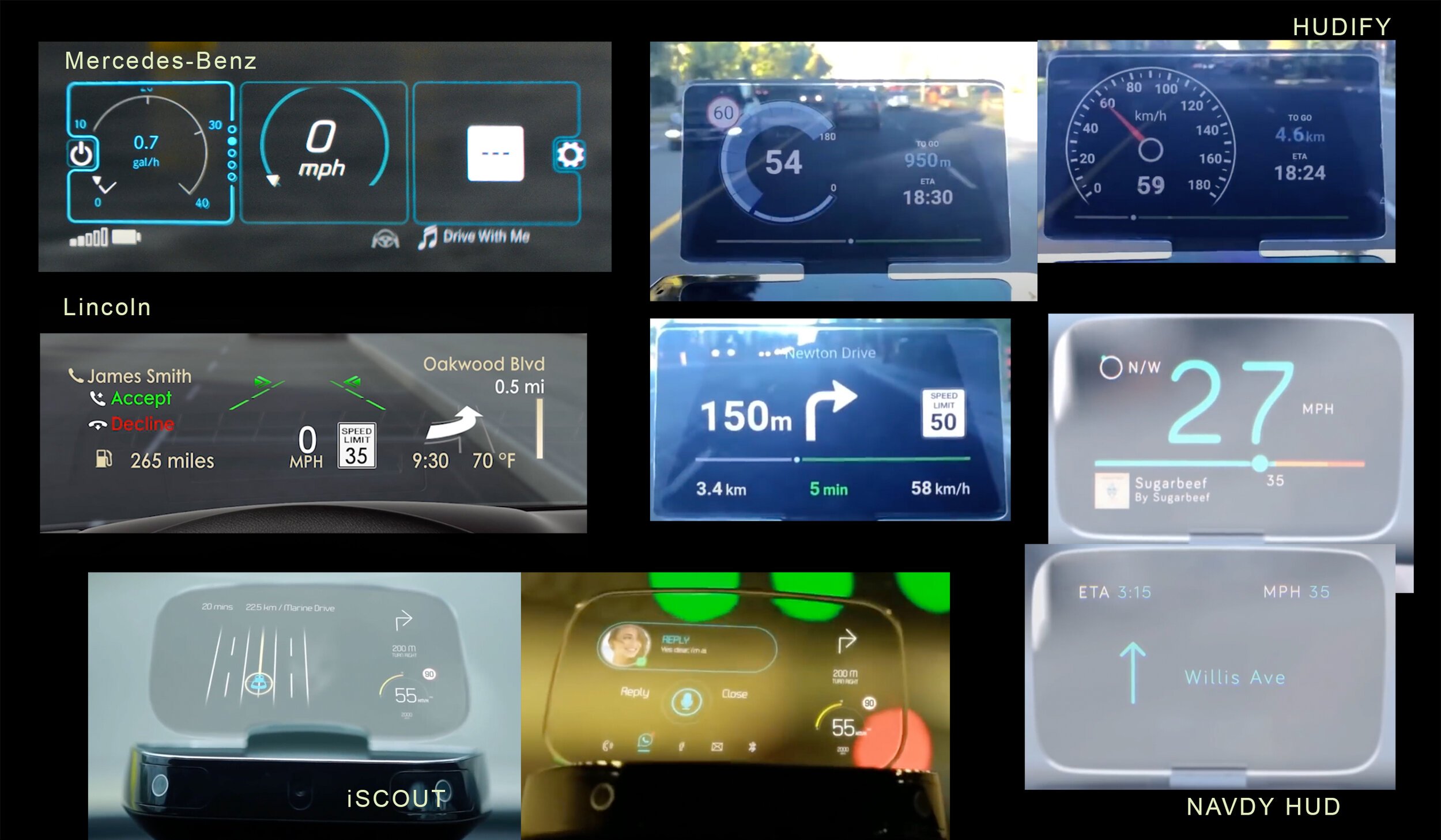
HUDIFY, iSCOUT and NAVDY utilize the phone as a projector onto a secondary screen, rather than having a built in car projector to project to the windshield. For most of these designs, the designs have a learning curve and might not be intuitive for the user to pick up—Users will have to learn what each graphic means (for ex, HUDIFY’s circle speed graphic). Additionally, there are quite a few features occupying the screen—particularly in the Lincoln and iSCOUT displays. These HUDs most commonly display speed, navigation and phone call related information. There is also a moderate amount of small text might be difficult to read when weather conditions change or when the car is unsteady/blurry. The main colors used are whites, neon blues, greens and yellows and display 2 to 4 colors on a single screen.
A few of these (Mercedes-Benz, HUDIFY) seem to offer customization options, allowing users to choose what and how many features to display. Furthermore, the ability to use the phone as a projector allows easier customization ability-rather than using built in car hardware to change settings.
iSCOUT and NAVDY involve the use of hand gestures to interact with functions like picking up a call. However gesture control may be distracting to the driver, or difficult to perform accurately.
Constraints
As found from the research, HUDs offer a efficient and safe way to access the most important information while staying focused on the road—it is a simplified version of the main dashboard. It offers fast refocus ability as the HUD is projected 2 meters in front of the driver. Migrating information to the windshield gives flexibility for dashboard design, and these HUDs offer the ability to customize + upgrade features while using wireless connection.
However, HUDs might not be widely normalized in cars today because of the following reasons:
• The value of manufacturing a built in display when considering the cost, size and relevance— user demand for HUDs might not be great enough for companies to implement widely.
• Projection is not the same as a display- can be hard to see sometimes from movement blur, or weather conditions (harsh sunlight & glare).
USER Personas
The primary users for this HUD display would be adult drivers (ages 20-35) who commute often that are interested in tech and driving safer. Having kids could also increase their desire for an HUD because of an increased need for driving safe.
Our secondary users could be teenagers getting started to drive (ages 16-20) who might want a car with great safety features and an efficient information system.
Our tertiary users target an older demographic—older drivers (ages 50+) who also want to drive safer. However, the design and technology may be confusing and harder to adapt to, so a reduct set of features to display would work best in this case.
From a business perspective, the primary companies this HUD targets would be car companies that either already have HUDs in place, or are looking into adding such features.

Three diverse personas each with their demographic info, goals, frustrations and a driving scenario
Interviews
I conducted a of couple short Interviews, asking questions relating to users’ driving experience and use of certain car features.
Interview 2:
• 58 year old, male in workforce
• Driving experience: high (daily)
• Car model: Buick Enclave
• Has experience with HUDs
Interview 1:
• 19 year old, female college student
• Driving experience: moderate (3-4 days in a week)
• Car model: Chevrolet Impala 2014
• Has not used HUDs before
Key Insights
Here are some takeaways I learned through research and interviewing:
• HUD is generally a good idea because it reduces dashboard clutter and displays only the most necessary information
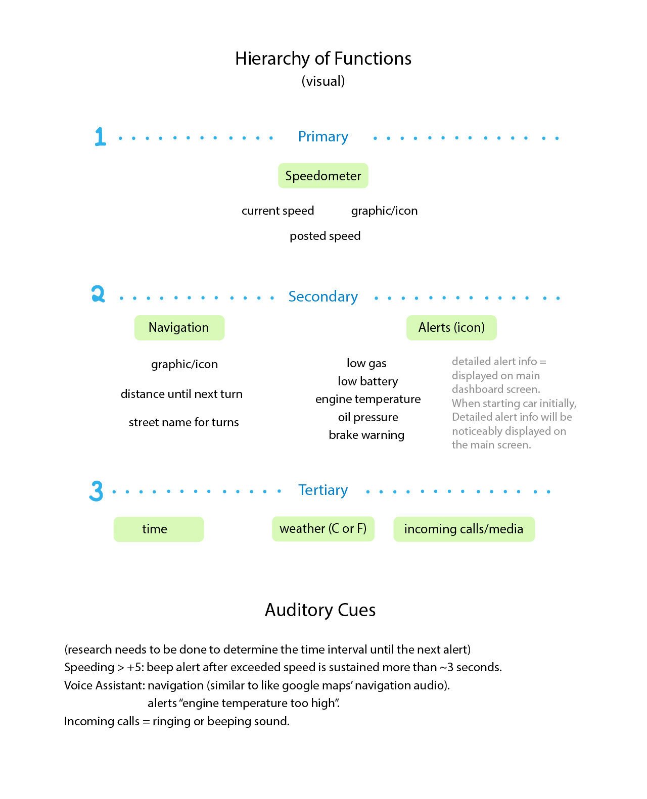
• all HUDs include speed. They also include secondary options (alerts, gps) as well as time, weather, calling/media
• There's a balance between how much alerting is too much/too distracting (this can greatly affect the user’s emotions and perception/relationship with the car).
• It should be clear what alerts mean.
• Possible alerts: speeding, gas and temperature problems, battery level, and lane changes (alerts can pop-up as they become relevant)
• Alerts should involve auditory sounds, colors or both. Perhaps even sensory information when considering accessibility—for people who can’t hear well or see colors well.
• HUD shouldn’t be crowded with too many features bc can be distracting and confusing. (like tesla lane display complicated dashboard)
• Use shape and color to visualize speed/information. Possibly depict driver’s current speed in relation to the posted speed with a graphic—users might not always need to read the number and can understand if they need to go faster or slower depending on the design.
• Gesture control is not very flexible and accurate but voice control might be a good alternative or addition
• Sunlight can cause problems with readability (haze) but display will still be faintly visible at worst (for some cars).
• Users would like the ability to customize features/preferences
• Wifi calibration (time, speed settings), users won’t have to manually keep updated.
Ideate
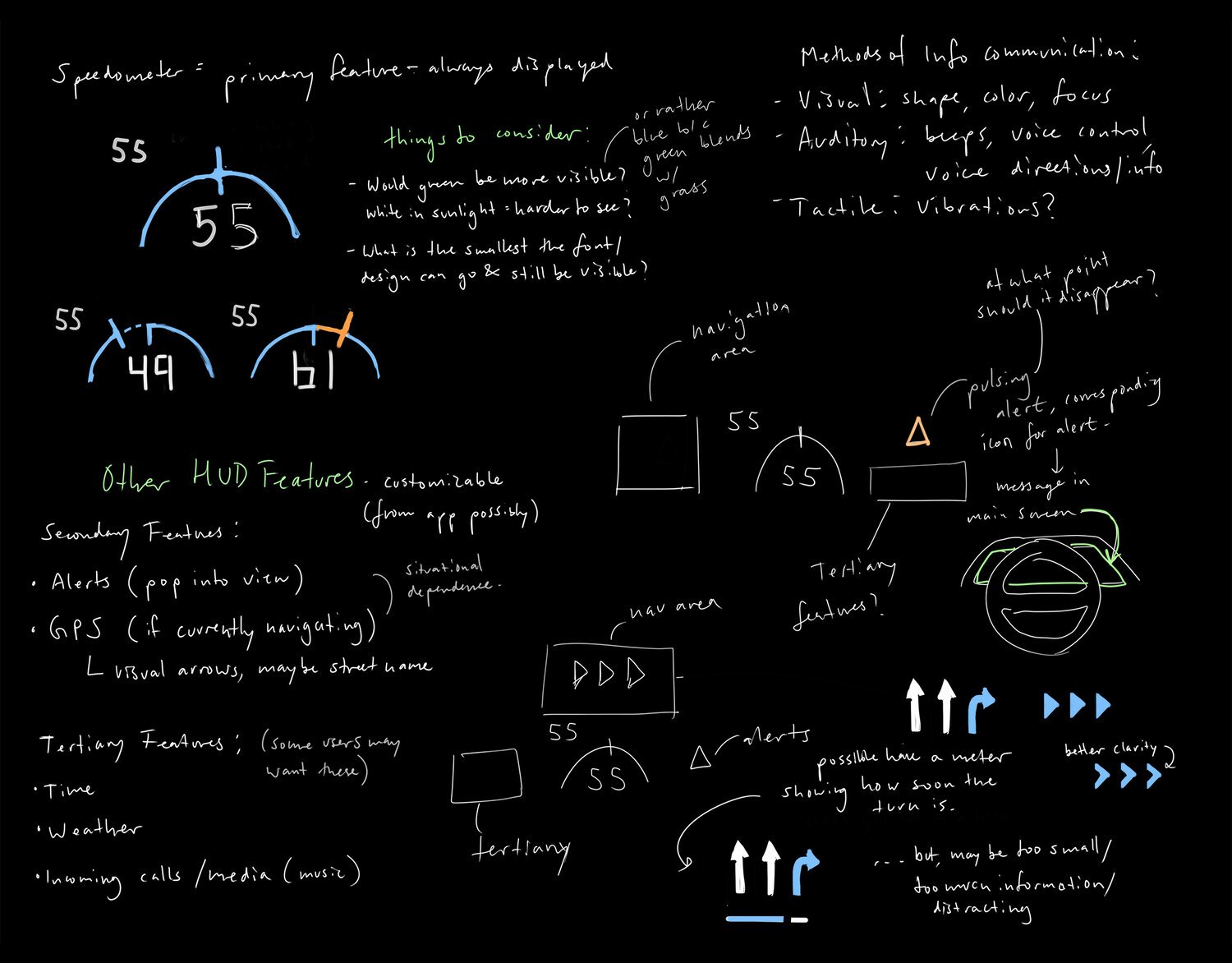
I started my Ideation process with a focus on designing a speedometer interface that was intuitive and visible to the driver. While I would like to flesh out other functions like navigation or alerts, the speedometer design would be the most important and crucial to have so I determined it as a primary function and prioritized designing for it first.
Keeping the Key insights described above in mind, I knew I wanted to strike a good balance between necessary information and overloaded distraction. I also knew I wanted to have this design be accessible to most users.
During this process, I had many iterations and feedback to spark changes while encountering many issues along the way.
Low fidelity
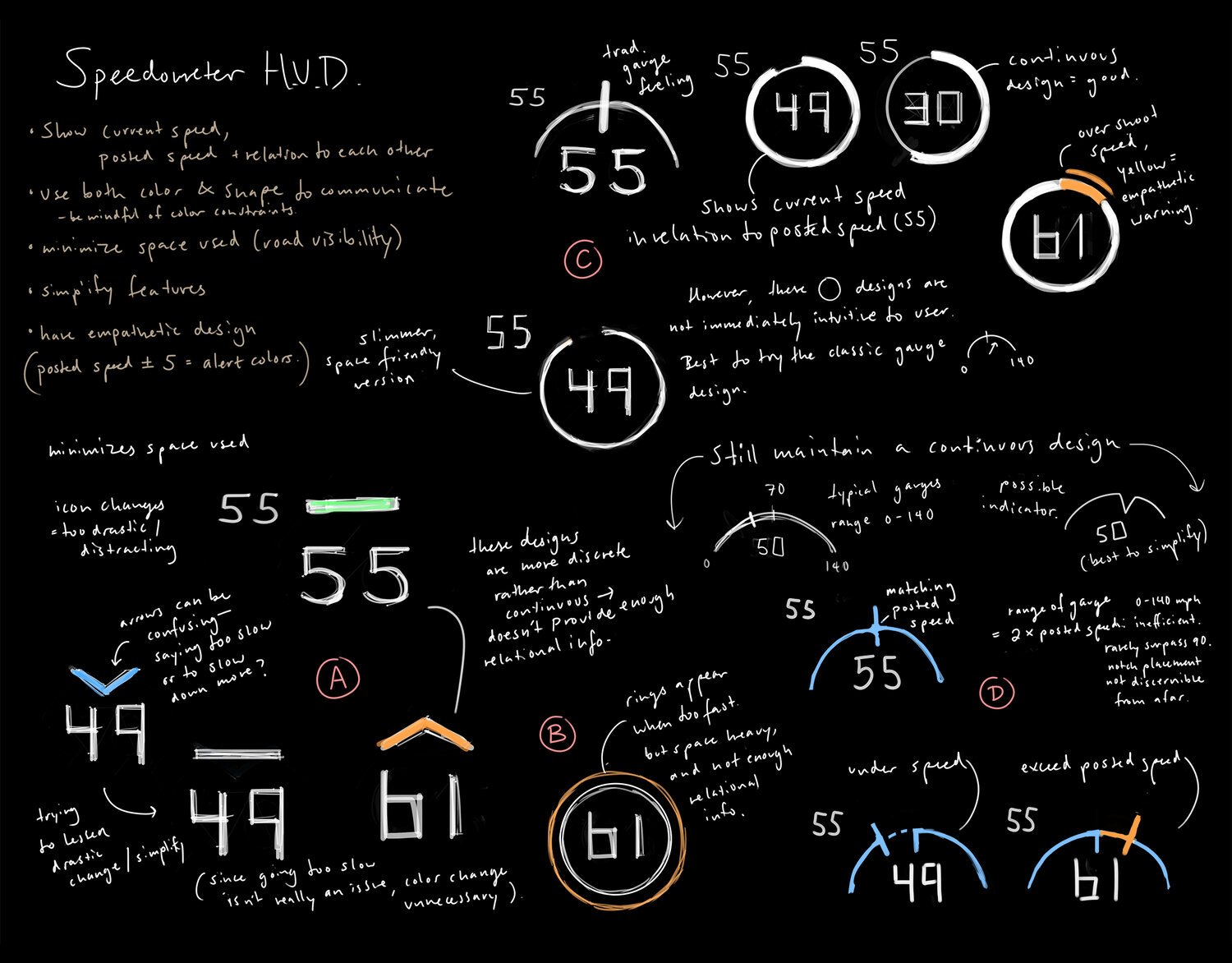
During my initial sketches for a speedometer design, I determined some properties I wanted my design to have:
• Show the current speed, posted speed and possibly their relation to one another
• Use both color and shape in the design (while being aware of color constraints), to minimize the space used (best to minimize space needed for HUD because the display does obstruct some of the road)
• Simplify each feature
• Have empathetic design (and build a good relationship between the user and the car).
During this stage, it was especially difficult to determine what % of the screen to occupy, and to find the right balance of how much information was acceptable until it became necessary and distracting. It was also hard knowing the visibility of each feature (distance, colors, font size) without being able to test it on an actual car.
Initial Sketches
Iterating on design “D” from my sketches
I chose design D with the blue semicircle gauge to work with because it made use of space efficiently, and was more intuitive than the other designs. However, I struggled the most with figuring out how the not hon the gauge might work. I realized that ac continuous moving notch might not be as useful—especially when viewed at a distance because the accurate incremental changes would likely go unnoticed by the driver. Thus I determined that byte sized information would be better in terms of visibility and practicality.
High Fidelity
During the process of high fidelity rendering, I continued to iterate even though I had planned to stick with my low fidelity sketch concepts. During this stage, I simplified the gauge design much further as I realized the small dotted and subtle details would be lost to the user.
I used neon blue green and orange as the main colors. Instead of using a pure white, I shifted the hue to be more blue as it might show better in the sunlight. I used the type “Highway Gothic” to mirror the same font used to actual speed signs. I experimented with more minimalistic designs but In the end, I decided to go with the designs from figure C due to a better shape contrast.

A
B
C
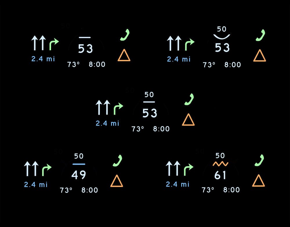
finalized UI
Final Design:
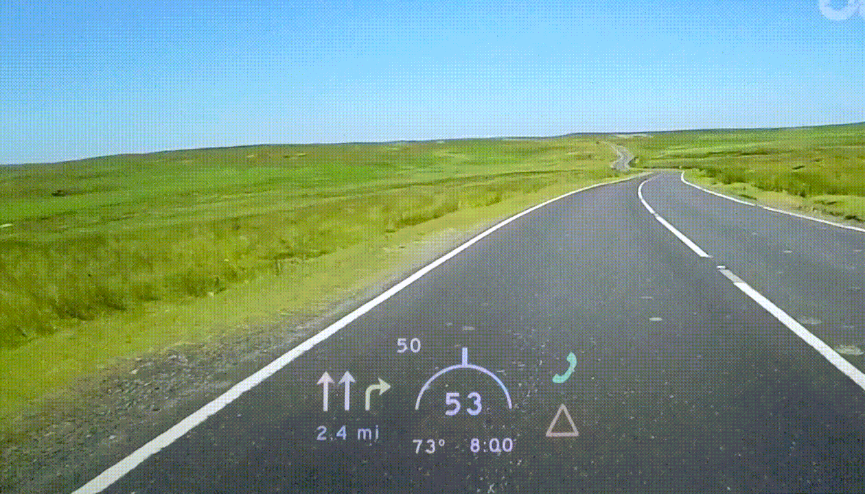
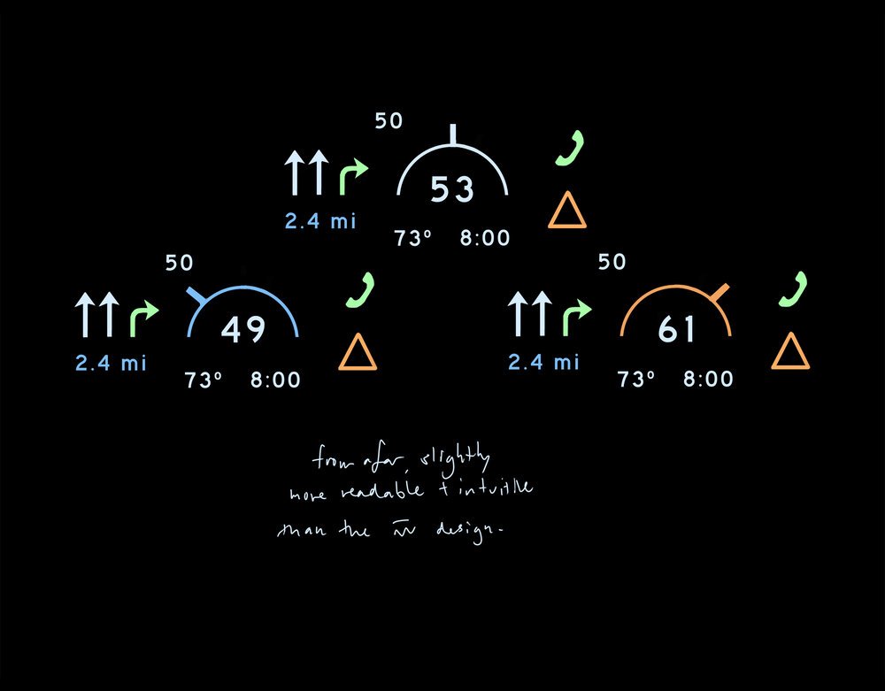
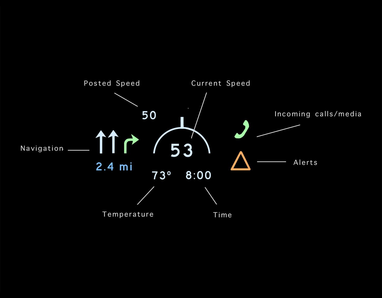
The final HUD features a speedometer with a gauge that changes color and notch position if the car speed is ± 5 from the speed limit. The rest of the features can be customized—the user can change their placement (left or right) and whether to display them or not. Features like incoming calls and alerts will pop into view as needed. The alert icon will change depending on what alert is is. Navigation graphics are shown as well as the distance until a turn. While it could be possible to change feature settings through the car, having an app designated for managing the HUD would be optimal. With an app, users can connect their navigation app of choice, switch their metrics- miles/km and F/Cº, adjust the height of the HUD and adjust colors as well. Connectivity to wifi will automatically sync the time.
Mockups & Testing
I initially positioned the HUD over a still image but realized it lacked the important quality of being in a moving car. I decided to lay the HUD over a moving video but realized the lack of projection limited the mockup from showing accurate results.
As a third attempt, I ended up using my phone to project the HUD onto my laptop screen while it played a driving video, and it ended up working well.

Projection mockup with normal road conditions
Projection mockup with sunny/harsh lighting
Feedback
After creating projection mockups, I realized how different the colors can be, and how subtle the color differences are—for example, the navigation arrows have almost no significant color difference. This may just be because of video quality or simply that this is a prototype but I realized that the primary way to communicate through design would be should be shape and not so much through color.
After getting some more feedback from low fidelity usability testing, I realized that this design was still not fully user friendly:
• It’s hard to tell what the read speed is (upper left “50” in the UI). Surrounding the posted speed with a square (like a road sign) might show its meaning better, or perhaps not showing the posted speed when the user is within the speed limit.
• The design of the gauge is still confusing—normally gauges don’t display your current speed. Based on how a gauge works, a user might assume the notch is telling you that that point in the gauge is the speed depicted below the gauge—when really, the notch is not functional as a gauge but more as a symbol. Gauges describe a continuous range rather than something like an on off switch.
• It might be hard to tell that it is a gauge in the first place, which might solve the above issue. With new designs, there will always be somewhat of a learning curve and this design would likely be simple to learn.
• Another way to subtly get the driver’s attention, is the use of motion/flashing for graphics. for ex, the posted speed limit could start flashing if the driver is speeding.
Reflection + Improvements
I decided to end this project at this point but there is so much more that can be done for improving HUDs and general car dashboard design. Next steps that I think that would greatly improve this project could be to: Conduct more research and investigate how gesture or voice control can be used in HUDs, as well as interview more users. For testing, it would be extremely helpful to test this HUD on an actual car with the right kind of projector and software; there can be many mechanical and software constraints that are hard to catch from a purely design standpoint. To expand this design, navigation, alerts and other features could go through iterations, as well as an app to control customizations. To add on to possibilities, AR/VR has great potential to revolutionize cars through immersive navigation/directing (I think some companies have already implemented these abilities).
For other car design topics, I’m curious to see how the phone —> car transition could be improved. Rather than having alerts and noises coming from a phone, having haptic interactions, or vibrations on the steering wheel could be an interesting investigation—especially for accessibility purposes where tactile sense could be greatly impactful. Generally, we see a trend towards bigger, fancy tablet-like displays, with more vibrancy and features, but there’s a great deal of backtracking that can be done to restore some of the haptic feedback crucial to car design. Finding the balance between haptic and touchscreen design would be a challenging yet fascinating topic.