
NASA - UX AR Design
Designing HOSHI, an AR interface for astronauts on lunar missions
How can we use augmented reality to support astronaut autonomy and safety during their lunar explorations?
Overview
NASA has been looking for innovative solutions to address astronaut pain points & needs during lunar expeditions—specifically to support the Artemis mission to return astronauts to the moon by 2024.
My team at the University of Michigan built HOSHI, an AR application on the HoloLens2 for astronauts that supports lunar navigation, geo sampling, and search & rescue in space.
Our design aims to inform and inspire the future of lunar exploration technology and interaction as space exploration turns towards mixed reality solutions.
Duration: Sep 2021 - may 2022
My Role: UX Design Lead, Product Manager
Skills: UX & AR Design, UX research, end-to-end system design, cross-functional collaboration
Tools: Figma, HoloLens2, Microsoft Mixed Reality toolkit, Unity
My Role
As the UX Design Lead, I headed the UX team of 7 in design, research and testing from conception to product launch. I had the fun of leading our team through an unexplored problem space filled with unique and unforeseen design challenges.
As Product Manager, I worked closely with our Software/AR Lead to communicate the design team’s vision, while prioritizing product features and scope from a high level. I also managed our iterative process of designing, testing and validation, and I communicated regularly with NASA stakeholders to discuss design requirements, scope and gather feedback.
Outcomes
My team was selected by NASA as one of the 11 finalist teams to compete in their challenge. During our product testing and evaluation at NASA Johnson Space Center’s rock-yard our test participants were able to successfully complete NASA’s stimulated test requirements and tasks related to navigation, sampling and rescue.
I pitched our application to NASA stakeholders (NASA astronaut, the Manager of NASA Extravehicular Activity, Director Specialist from Microsoft), had them experience our application, and received overwhelmingly positive reception from these stakeholders.
NASA selected to use our design for an internal technology demo,—we delivered the application and code, as well as a user guide for NASA to use.
Demo
Demo scenario: Astronaut Jane is sent on a lunar mission with her crew member Neil and uses our AR application HOSHI, to assist her. She uses functions like the map, directional aides and our voice assistant VEGA to navigate to landmarks, conduct geological sampling, and help Neil in an emergency.
AI voice assistant “VEGA” (Voiced Entity for Guiding Astronauts) for user command/input.
Visual & audio user feedback.
Primary interaction/input: voice control.
Secondary interaction/input: physical gestures (finger, hand ray).
Fallback interaction/input: If all input methods fail, fall back to NASA’s traditional methods (physical notes, traditional voice comms)
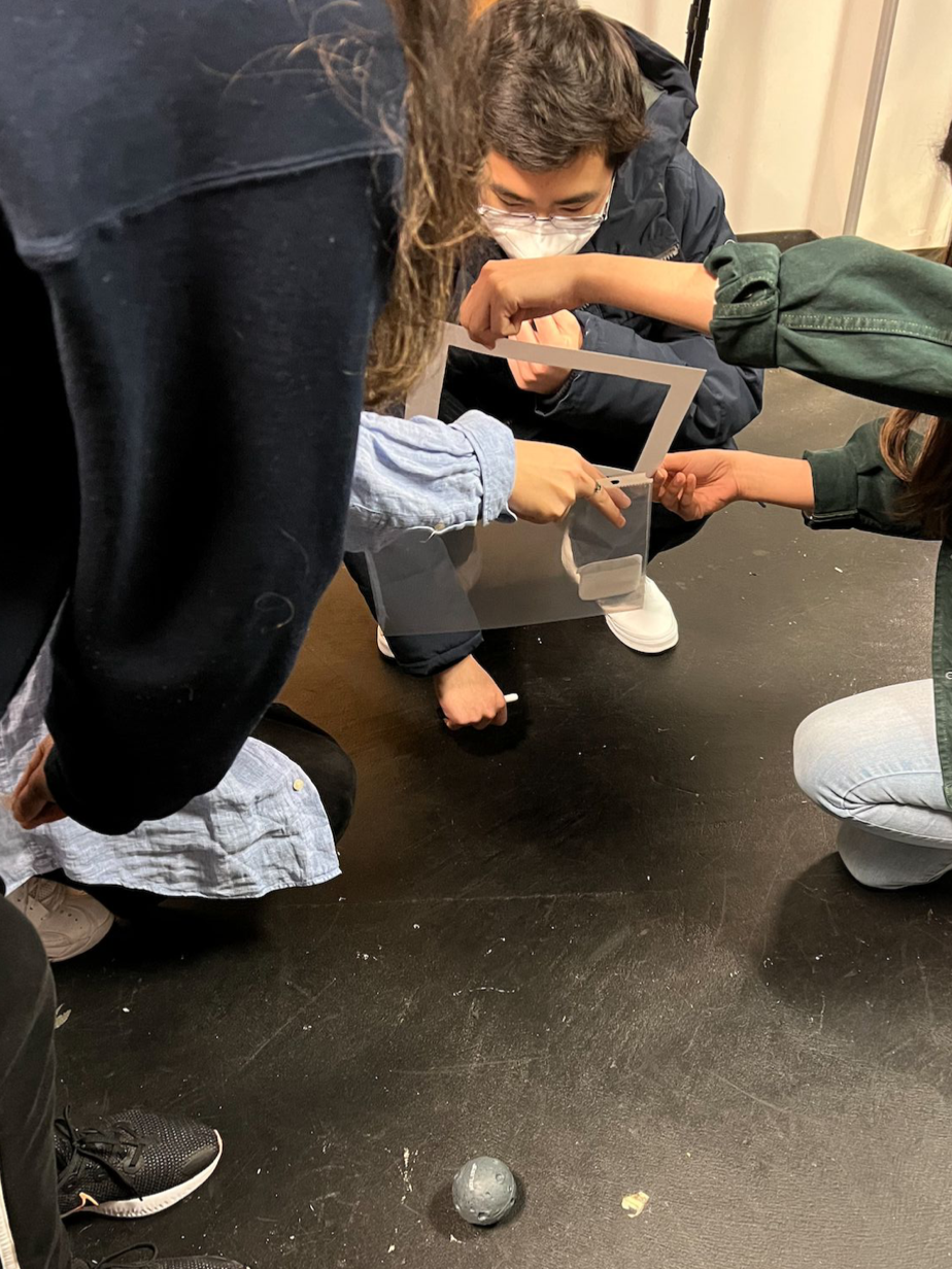
My team and I tested and filmed HOSHI in use at NASA Johnson Space Center’s rock yard test site under lighting and terrain conditions that simulate the moon.
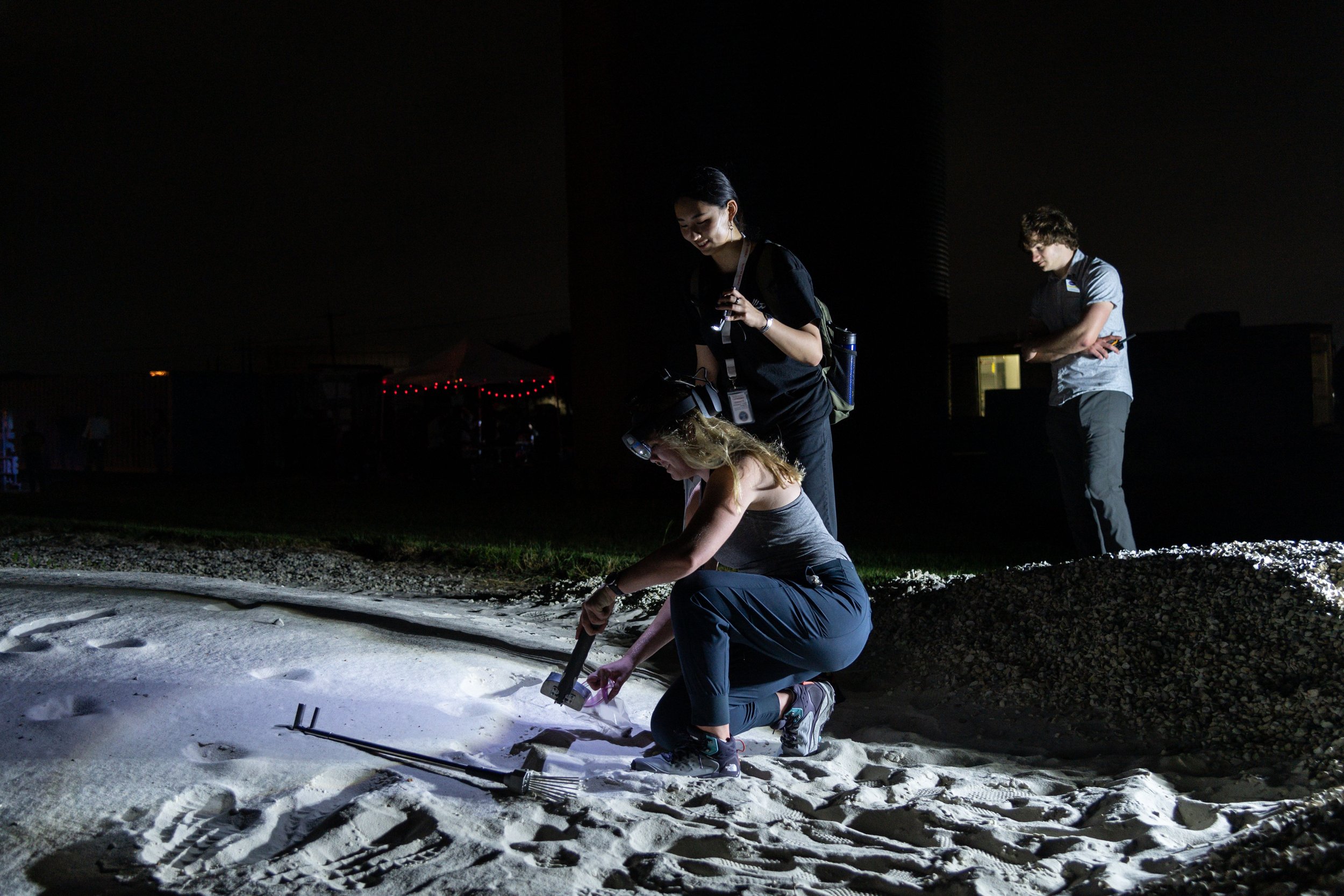

Pictured above, I’m accompanying Morgan Kuligowski (ISS Biomedical Flight Controller) and Christopher Hansen (EVA manager) as they test our AR application in the Space Center rock yard
Feedback from NASA Panelists & Stakeholders
Christopher Hansen - Manager, Extravehicular Activity Office at NASA
Kathleen "Kate" Rubins - NASA Astronaut
Paromita Mitra - Principle Investigator at NASA
Jennifer Ott - Federal Director Specialist at Microsoft
Dr. Gamaliel "Dan" Cherry - NASA Educator Professional Development, Deputy
“I really liked your video because it showed me exactly from the user point of view what you were doing through a couple of different tasks, and it really gave me the sense of how someone would interact with your device.”
— Kathleen "Kate" Rubins, NASA Astronaut.
“One of the features i really like interestingly are your navigation aids that are always pointing home…it's really easy to lose situational awareness it's kind of nice having a simple feature that's pointing back if something goes wrong…it was subtle and it was really nice”
— Christopher Hansen, NASA EVA Manager
Ok, rewind… how the heck did we get here?
This project walks through:
Scope + requirements
Discovery phase—understanding users and problem space through research
Framing the design challenge
Key design challenges I worked through
Impact/Next Steps/Reflection
Scope and Workflow
Timeline

Our team started with user research and information gathering, later moving to low fidelity and low budget ideation and testing. Closer to our design evaluation date, we entered an iterative high fidelity design & testing feedback loop with the software team.
The Team

Our cross-functional team of 14 is composed of designers, engineers, and researchers.
My Key Contributions
I owned the overall end-to-end conceptualization, testing and iteration for HOSHI’s user experience, These are the features I took a deeper dive on:

NASA wanted us to:
“develop a user interface (UI)… to assist extravehicular crew members perform navigation and system state monitoring tasks during a lunar EVA, or Moonwalk,'“ and “provide augmented reality (AR) access to informatics to enable interfacing with lunar payloads, support science work, visualize consumables, streamline communication, and navigate terrain.” [requirement doc]
In simpler terms:
How can we use augmented reality to support astronauts during their lunar explorations?
These requirements were open ended, making it tricky to define the scope of the project in the beginning. Through my research and discussions with software and our NASA contacts, I prioritized these key functions for the team to focus on:
Lunar navigation (long and short range, routing, AR guidance, search + rescue)
Search + Rescue (messaging, system alerts, biostatistics, navigation)
Geological research + sampling (documenting samples, voice notes, camera)
As deadlines approached, requirements changed and roadblocks popped up, I often had to cut and reprioritize features throughout this project.
As the UX Lead, I piloted the conceptualization, testing and iteration for HOSHI and it’s design system. I managed our UX team of 7, delegated tasks, led meetings, and tracked our deliverables.
When wearing my Product Management hat, I managed our overall timeline + scope and conducted meetings between UX, Software and NASA to communicate our vision, and collect feedback. These meetings also allowed us to pivot and change scope as requirements and time constraints from NASA changed.
NASA’s Requirements & Defining Scope
To begin, let’s try to understand our users—
What is space like? What is the current astronaut experience?
Discovery
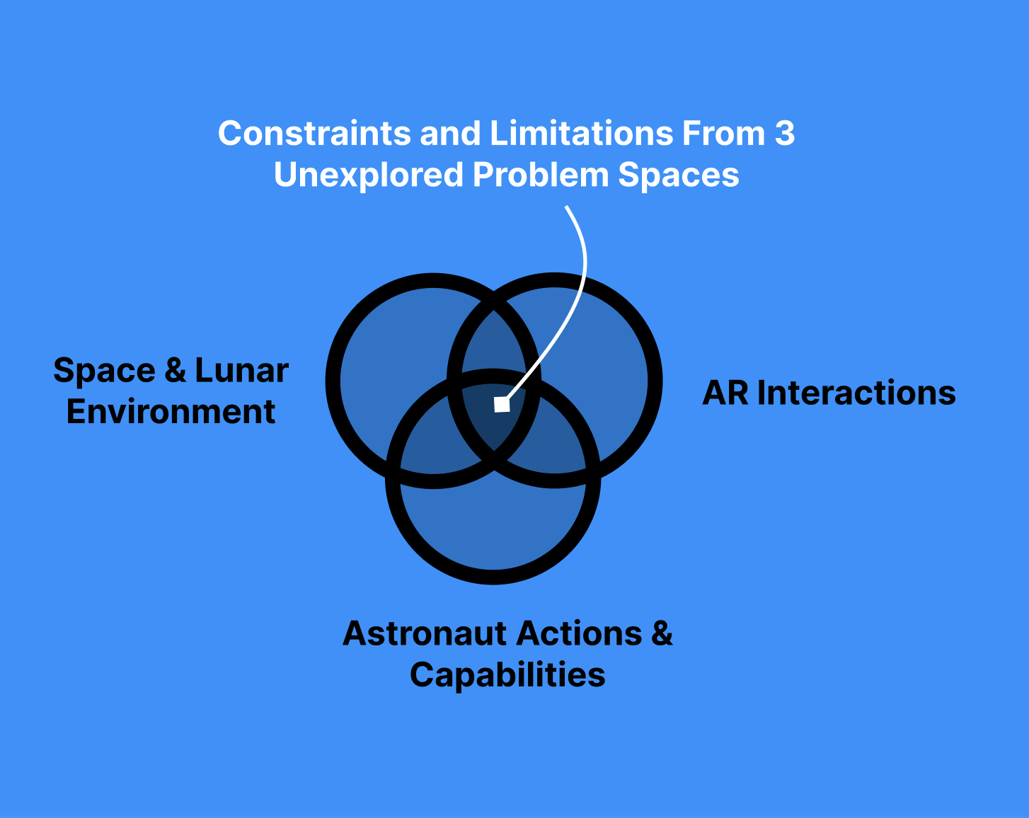
An Undefined Problem Space
Before sketching anything, I first wanted to understand the problem space and the users I was designing for. However, Information about how astronauts currently conduct lunar mission tasks was near impossible to find throughout this project, and augmented reality was still a very new and undocumented field.
Documentation about the intersection of these spaces (astronauts, the moon and AR) was practically nonexistent. This discovery phase was an essential first step.
I had prior experience designing within this problem space from being a designer on the team previously [View our 2020-21 design here]. Because this year’s design requirements had shifted, I decided to approach the project from square one since I was leading an all-new team of designers; there was too big of an information gap to bridge from the previous design.
How can we use augmented reality to support astronauts during lunar explorations?
Discovery Goals
Understand users: What are current astronaut operations on lunar missions like? What tasks and actions do they perform?
Understand their pain points: What do astronauts struggle with the most? How can we support them through design?
Methods Used During Discovery
Heuristic Evaluation + Literature Review/Research
Initial sketching + exploration
1:1 expert interviews
Method 1. Heuristic & Literature Review

I first reviewed Interviews from the previous year with past NASA astronauts and lunar + geologist scientists.
I then reviewed NASA’s concept of operations document for past missions, which included detail about astronaut tools and mission procedures.
Lastly, I evaluated the usability of the previous design, and noted its strengths and weaknesses
This first method allowed me to gain a broad understanding of the problem space from a high level, and helped me to direct the team’s focus in this beginning stage. Having a base layer of understanding allowed me and my designers to start sketching and sharing ideas as the next step.
Method 2. Sketching & Exploration

In this phase, my team and I were able to communicate and visualize our designs. Having an open mind and encouraging ideas was essential to solving such a niche problem. This process shed light on the holes in my understanding of the problem space, and made me realize what exactly I didn’t know, what questions to dig deeper on, and what assumptions I had to make.
Sketching ideas and having conversations allowed us to prioritize which areas we wanted to understand more deeply. As a team, we still felt very distant from the problem space. With a need for a deeper understanding and a running list of questions, I guided the team into our next method—user interviews.
Method 3. User Interviews
My team and I conducted 4 user interviews with a spread of users—past astronauts, and an engineer from the EVA (extravehicular activity) group at NASA. Throughout our process, we returned to these users to continue to get feedback through user interviews and usability testing.

Here’s what I found from my discovery phase:
Discovery & Research Findings
The Current Astronaut Experience
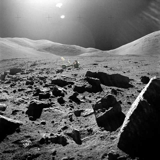
What are environmental conditions like?
Astronauts have limited visibility due to extreme lighting conditions, and limited depth perception. For safety, astronauts must stay within non-shadowed regions
“If you're looking at something like your own spaceship, and you know how big it is, yeah, that's fine. But if you're looking away from it into territory you've never seen before you have no idea how big those rocks are.
And the Apollo guys they were amazed. They would [...] head over that way because they went to look at that rock, turns out that rock was kilometers away and they couldn't tell.”
— p1, retired NASA astronaut
How do they communicate?
Astronauts relied solely on voice channels to communicate with fellow crew members and MCC (Mission Control Center on earth).
“But other than that (biometric data), all that we get out of the space suit is what the astronaut says, so it's you know it's very much of a sound system right now coming into now we don't have any sort of a complex visual input output system”
— p1, retired NASA astronaut
How do they navigate?
Navigation is currently a large pain point. Environmental conditions are disorienting and there is no such lunar GPS on the moon. Each mission and its destination waypoints are thoroughly planned and researched prior to execution. Crew members are guided by MCC through their missions 24/7 through their audio comms.
How do they conduct geological sampling?
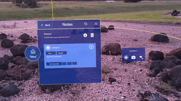
Astronauts follow specific sampling protocols for documenting samples that they must remember, or be guided by physical documentation or experts on earth. There is no digital format for documentation. The only form of on the field note taking is with a traditional pencil and paper cuff.


pictured above are lunar lighting conditions, geological procedures, and an astronaut’s suit with paper cuff.
Key Astronaut Pain Points

In their current missions, astronauts struggle most with orienting themselves and navigating in space. Without tools that support independent and autonomous decision making, astronauts are heavily dependent on Mission Control’s commands, and use outdated and inefficient processes.
Setting Design Tenets & Scope
With so many factors to consider in this problem space, I constructed these design tenets to help inform the design team’s design decisions. When struggling with making decisions or scoping our work, The team and I were able to fall back on these tenets and keep the team unified in our work.

Overall, these three tenets point towards an Assistive AR experience: Astronaut focus should be on real world interactions. AR interactions should be secondary and support the user’s primary task.
Balancing Safety & Autonomy: The system must both support astronaut autonomy while still prioritizing their safety.
Things to consider: Actionable information, minimizing cognitive load, balancing informationVisibility & Accessibility: AR Interactions should not distract from real world actions.
Things to consider: Voice command, colors and UI placement should be designed to increase accessibility.Trainability over learnability: the target user is not the average person—features should be designed to match the mental models of these users, with the assumption that these users will have a training period with the design.
But Why AR?
Information overlays provide visual support
Improved autonomy and efficiency
Spatially anchored virtual labels in user’s environment improve spatial awareness
Reframing the problem:
How can we create an AR assistive experience to support astronaut autonomy and safety during their lunar explorations?
Moving on from discovery, below are some key design challenges I worked through.

Key Design Challenges
The pain points found in our research presented themselves as specific design challenges. Through user testing, referencing the design tenets and keeping AR constraints in mind, I was able to problem solve through these challenges.
Four Key Challenges I addressed:
Challenge 1: How do we build a flexible AR design system?
Challenge 2: How can we support lunar AR navigation?
Challenge 3: How can we Improve accessibility?
Challenge 4: How to best design for AR?
Challenge 1: How do we build a Flexible AR Design System?
Jane, an astronaut on a lunar mission, needs a robust visual system to support her mission tasks. Currently, Jane does not have any visual system guiding her. This limits her autonomy and misses opportunities to improve her safety.
Our AR system needs to:
1. Have an easily accessible entry point/ingress to the system (avoid cognitive + physical fatigue)
2. Be minimal and nonintrusive both in its default/dormant (when Jane is not using the system) and active state
Overall tenets of balancing Safety & Autonomy, prioritizing Visibility & Accessibility and creating an AR Assistive experience also apply to this particular challenge.
This system also needs to be robust and scale when more functions and tools are added.
The first step in exploring what type of information astronauts needed to see and act on, was to sketch and explore with an open mind. The following sketches explore element placement, depth and size. I had to design with limited real estate in the HoloLens field of view and account for astronaut physical limitations in eye/arm/bodily movements. Different areas of the AR space came with certain tradeoffs.


When designing the system’s dormant/default state, I considered: What should be visible/accessible at all times? Where to best place these interactions (x, y, z axis)? How should this system entry point be designed? I explored these questions through varying the design, interaction and placement of the UI.


To rapidly evaluate and compare these designs, I used paper prototyping. This helped the team quickly test and identify which menus best satisfied our need for accessibility and visibility. Taking into account scalability, we moved away from certain designs as well (circular and scrolling menus)
“Does the menu always follow me? I can’t really see anything when I bend down” — Participant 2
To reduce physical input requirement (AR Hand rays) from the astronaut, all menu interactions (and system wide interactions) are mirrored with simple voice commands such as “open menu”, “follow me”, “clear view”, and “reset view”. This reduced the amount of visual UI and physical interaction needed.
Our menu was able to retain a minimal design even when expanded, and contains only the most essential information (which our team determined through user interviews and testing).
I considered how the menu and system as a whole would follow the astronaut in space. I designed voice commands that allow the user to have the menu stay anchored to space or follow them around. Users can also “recall” the menu to bring it back into view. Our final (left + centered) menu placement, size and design had incrementally evolved through multiple rounds of testing and iteration with the HoloLens in AR as well.
Through this process of sketching, evaluating placement and interaction tradeoffs, and rapidly testing with paper prototypes, I built a designed AR system state that was accessible, visually nonintrusive, and scalable.
Scenario:
The AR system is dormant by default (only the menu UI button is visible). Jane has an unobstructed view, and can focus on her real world tasks. If Jane needs to view her menu widget, she can do so via hand ray or voice command. Jane can quickly clear/reset her view and return to the default system state to proceed with her task at hand.

Challenge 2: How can we support Lunar AR navigation?
Jane needs a more autonomous and informed way to navigate to a waypoint. Navigation on the lunar surface is difficult, disorienting, and depth perception is a big challenge. Current way-finding methods are heavily dependent on audio command from Mission Control.
The AR navigation experience needs to:
1. Guide Jane to lunar points of interest via AR navigation
2. Provide Jane a safe route, and allow for flexible route planning.
Again, this navigational experience must balance Safety & Autonomy, prioritize Visibility & Accessibility and be an AR Assistive experience.
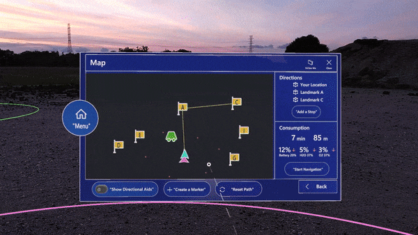
Directional Aids

This early concept explores the use of a compass/gps to improve orientation and spatial awareness (through our research, I learned that neither compasses nor GPS works on the moon).
Rather relying on global markers, I opted for a local approach where astronauts orient themselves relative to lunar landmarks (the lander, rover etc).
Using a minimap (bottom right) was found to be too obstructive in early user testing as most astronaut interactions will be near the bottom of the HoloLens field of view.

Shifting from a 2D to AR based approach, I proposed a directional aid experience where AR markers move around the peripheral of the viewport, serving as indicators for various landmarks.
Rather than using static 2D UI, the entire viewport becomes an opportunity to convey information. Jane the astronaut would be able to instantly gauge her position relative to these landmarks without needing to pull up map UI.
One key iteration to this was to use both color and symbol to convey more information more quickly.
"One usability test participant expressed that “The dots themselves are not useful. But having labels on them are. Symbology has to be consistent.”
Per this finding, I pivoted from using dots to arrows. As the astronaut follows these directional aids, rotating until the particular arrow/landmark is in view, the arrow turns into its respective landmark icon.

Navigation Path
The second arm of the navigational experience was en-route guidance. Initial concepts explored how a route might look in AR.

During the iterative process, I kept in mind how visually distracting/obstructive the UI was. Providing the right amount of information without violating design tenets on visibility/safety/autonomy was a tricky balancing act. In addition to this, I also kept in mind best practices with AR design (motion sickness, accessibility).

While the ground level and mesh grid pathing showed the most amount of terrain and navigational information, they also took up a large amount of real estate, occluding real world visibility of the terrain. The eye level interactions on the other hand were less intrusive, however they may be lacking in guidance or may be too abstract of concepts.


My team conducted multiple rounds of research, interviewing, and usability testing with the HoloLens.
Scenario:
Jane starts navigating to a waypoint. She turns on her directional aids with a voice command and is able to quickly get a sense of her orientation. While navigating, she is able to stay on track to her destination as a spherical path guides her. This path is above head level and her view of the terrain is unobstructed. Jane looks around the site for interesting samples to collect. Her attention remains on her environment.

Challenge 3: How can we Improve Accessibility?
Space brings a whole new set of challenges within accessibility—even for able-bodied astronauts. Requiring astronauts to user their hands and arms to interact with the interface would be exhausting and unsafe. To improve their ease of interaction, I strove to support astronaut interactions through accessible and low-effort actions.
Hands Free Voice Control—VEGA
Our system prioritizes minimal interaction methods:
Primary interactions: voice control
Secondary interactions: eye gaze/eye hover, physical (hand, head) gestures
Feedback given through visual, audio
Fallback given through traditional methods if technology fails
We developed VEGA our voice AI assistant, activated with wakeword “hey VEGA”. VEGA receives voice command/input, and is the entity providing voice/audio guidance. VEGA enables a hands-free experience and similarly reduces the need to visually display information.
One of our goals was reduce friction when using voice commands. Upon calling “hey VEGA”, VEGA is active and listening for input for 5 seconds. If the astronaut has multiple commands, they can forego calling the wakeword multiple times. With every input, the timer resets another 5 seconds.
Voice commands also proved to have a higher learning curve. We provided a cheat sheet widget with a list of commands, but realistically, astronauts go through long rigorous training and our assumption was that these astronauts would need to take time to learn these commands which allowed us to include designs with higher learning curves in favor of a long term easier experience.

VEGA is especially helpful for geosampling tasks where the astronaut has their hands occupied, and may not want to be looking at a piece of UI. With VEGA, Jane is able to open her notes, take a picture of the rock sample, and use voice to text to transcribe her notes.
Challenge 4: How to best design in AR?

When shifting from 2D web to 3D AR, things like color, text, size, shape etc. must be designed with another layer of consideration. Designing for AR has a completely new set of challenges with accessibility.
Handoff workflow with Software team—using Figma to communicate AR, libraries to speed up our process, creating our own templates. Weekly testing and feedback sessions (usability, bugs, software limitations), asynchronous status updates.
UI in AR appears translucent, which was hard to work with in this problem space. The moon has extreme lighting conditions and in bright areas lit by the sun, the AR shows very faint. With this challenge of visibility of the UI itself, the intentional use of shape and color was critical and influenced our color choices (blues and greens being easier to see in AR).
By default, the HoloLens was designed for indoor every day use cases—certainly not for astronauts in bulky suits in space. Given the challenge of interacting with hands/fingers, we based off our design primarily off of eye gaze and voice command interactions. (We ended up unable to use the eye gaze function due to a software limitation).
When initially designing for eye interactions, we wanted to minimize the amount of eye movement/strain. We were very mindful of placement and distance—interactions in the corners of the AR space taxes the eyes. Having too much variation in UI depth also requires the eye to change focus.
A combination of voice and eye gaze was our AR concept of a cursor and click interaction (eyes = cursor, voice command = click)
We also had to be mindful of distance limitation in the HoloLens as it has a max spatial range of 3 m.
Sound design and haptic feedback also improves the experience in AR to supplement primary interactions and provide feedback.
Too much movement or animation may induce motion sickness (when UI does not match real world movement).
Impact & Next steps
My team tested HOSHI our AR application at the NASA JPL Rock Yard in the stimulated lunar/crater environment. We presented our designs and spoke with astronauts, research scientists and management at NASA about our product.
NASA is actively exploring the AR space for future missions, and our design feeds into this effort.


above are images from our test rounds at NASA’s rock yard.