
Mynest
App Prototype
Mynest
"Where home is at your fingertips"
Sep-Oct 2019
Tools/Skills
• UI/UX, Adobe XD, Figma, Illustrator
• User Research, Information Architecture, Wireframing + Prototyping
The Challenge:
Roommates needed an efficient way to distribute tasks and streamline communication in order to lessen conflict and save time.
The purpose of Mynest is to provide the college/student demographic with an easy and quick way to organize the process of living together and make their lives easier.
I created this app in response to a class design prompt about "making the lives of roommates easier".
Personas
1. college roommate, graduate roommates (young working class)
2. Short term (few weeks)(travel, camps)
3. Families
I deduced that the primary audience would be college/graduate roommates or the young working class. The age demographic is catered towards young adults and is meant for long term usage between strangers or friends (at least a few months).
My secondary audience includes short term roommates (together for a few weeks/months). Whether it be for work, travel purposes or seasonal camps, users of any age that need an organizational tool to coordinate with strangers or friends may turn to Mynest.


I created an empathy map for my primary user to better understand the user perspective and have an empathetic approach to my design.
I also mapped out the structure of the app with the key actions I wanted to include.
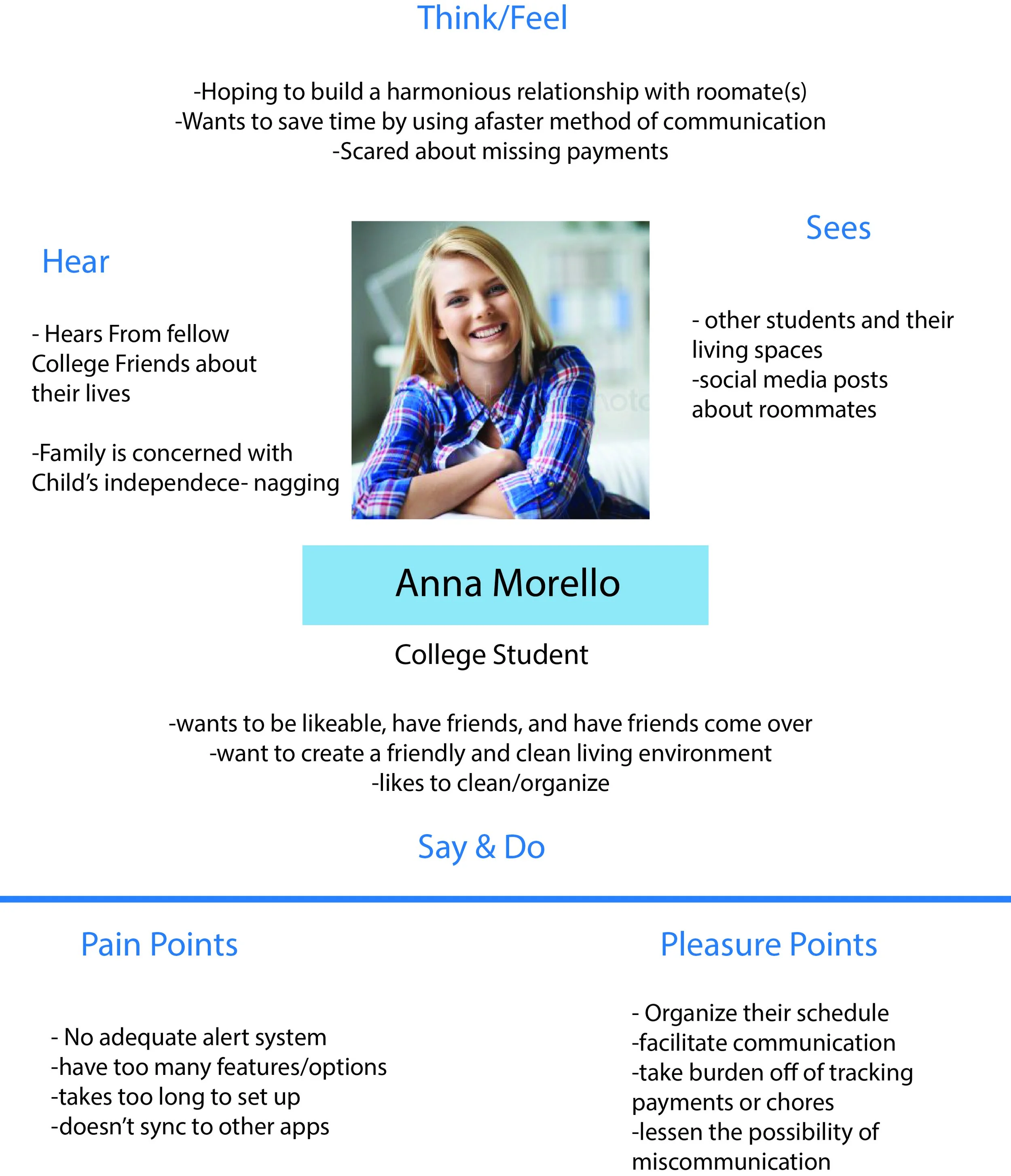
Empathy Map for Primary User

Information Architecture of the app (Adobe Illustrator)
Wireframes
I created both low and high fidelity wireframes in Adobe XD and exported them to Figma to prototype.
Low Fidelity
In my initial brainstorming phase, I created multiple wireframes for how certain features could look. Below are some rough drafts of the home/activity screen, task adding screens and social screen.


High Fidelity Features
After my low fidelity wireframes, I continued to iterate on those screens as well as adding new features as well. While the UI was not the focus of this project, I decided to go for faded pastel backgrounds with pops of colors to signal different tasks and calls to actions and a sans-serif typography. All icons and graphics except for the profile images were created in adobe XD.

The activity screen is the home/default screen of the app. It provides a simple overview of upcoming tasks, events, and a log of all recent activity.
The hamburger menu on the left opens up preferences where the user can edit their profile and change their “at home” status. The location option can be set “on” to automatically update your “at home” status, or can be set “off” where the user can manually update their status.
The task page lists all upcoming/unfinished tasks with most pressing tasks at the top. There is also an option to pin important tasks and have them stay at the top until completion/deletion. At the top is also a shortcut to the user’s personal tasks—divided by incomplete and completed tasks and sorted chronologically. At the top is also a directory to completed tasks. By swiping on a specific task, there are options to mark as done, delete, edit, and nude (to remind the assigned person to do their task). Tapping on a task will open a pop-up with task details.
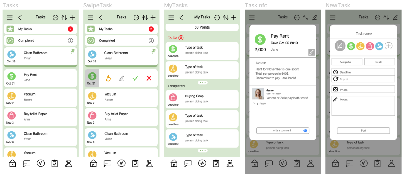

the people page displays all the roommates that have been added to your household. It also displays their current amount of points (redeemable through completing tasks), and if they have invited any guests currently over. Clicking on a user’s picture/name will take you to their page where you can see their contact info, the tasks assigned to them, and tasks they have completed.
The calendar page displays a calendar with all tasks marked with a circle: completed task are marked green, and upcoming tasks marked grey. There are also small orange dots which indicate a household event like a meeting or potluck. At the top is a signifier showing how many upcoming events there are within the month. Clicking on a specific day displays information at the bottom detailing the type of task/event.

The “Who’s Home” section is a fairly unique safety feature that allows users to share their location when coming home- which can be automatically shut off when they arrive home, or manually adjusted. The house animated icon will be fully filled with green depending on what fraction of the roommates are present. The “home” status can also be toggled in the side vertical navigation.

The messageboard is a basic chat room that allows users to communicate within the app–this allows them to keep all roommate based conversations local. There is also an option to attach photos/files.
Reflection
As a next possible step, I plan to develop the safety aspect of this product more, specifically in the "Who's Home" feature, and incorporate real time location services and safety communication. Additionally, I would like to flesh outs once of the features after doing user testing and getting some feedback on the current design.
.
Overall, this project was more challenging than I expected because I had decided to include so many features which had eaten up a lot of time and prevented me from focusing and perfecting a small amount of features. In fact, I was debating whether or not to include the safety feature of the app in the first place because it more out of scope than the other features. However, I decided to include it anyways because safety is a big part of a roommate experience, and it would offer something I hadn't seen before in other roommate apps. Perhaps taking a more minimal approach would have worked better. I aimed to create a minimum viable product (MVP) but I think including less features might have worked to my advantage given my time constraints.